Editor’s Note (Updated September 2025): This article was first published in 2020. We’ve refreshed it with updated insights on color psychology, accessibility guidelines, and 2025 design trends to help you make the most effective signage choices today.
Choosing the right colors for your sign is more than just a matter of aesthetics. The right color combination enhances visibility, readability, and brand recognition, while the wrong one can render your sign invisible. Here are updated best practices and examples to help you make your sign stand out.
Why Color Choice Matters
- Visibility from a distance: Signs are often viewed quickly, while people are driving or walking. Strong contrast ensures instant recognition.
- Brand recognition: Consistent use of your brand colors strengthens your identity.
- Accessibility: Signs should be clear for everyone, including people with visual impairments. Following contrast standards makes your sign more effective and inclusive.
High-Contrast Combinations That Work
The most important factor in sign readability is contrast: the difference between text color and background color. Here are combinations proven to be effective:
- Black on Yellow: one of the most readable pairs, often used in traffic signs.
- White on Blue: clear and professional, commonly used for directional signage.
- Yellow on Black: bold, high-impact, and easy to see at night.
- White on Green: calm, legible, and great for informational signs.
Tip: Avoid pairing colors that are too close in brightness (e.g., red on black, blue on green), as they blur together at a distance.
Color Psychology in Signage
Colors don’t just attract attention: they send a message:
- Red: Urgency, energy, and excitement (great for promotions).
- Blue: Trust, professionalism, and calmness (ideal for banks, healthcare, and corporate signage).
- Green: Growth, health, and nature (used for wellness or environmental businesses).
- Yellow: Optimism and visibility, but best used in moderation to avoid glare.
- Black & White: Timeless and versatile, providing maximum contrast.
Accessibility & Compliance Updates
Modern signage should account for accessibility guidelines:
- Contrast ratio: Aim for a contrast ratio of at least 70% between text and background.
- Avoid color-only communication: Don’t rely solely on color (e.g., “red means stop”) without supporting text.
- ADA compliance: For permanent interior signs, follow the Americans with Disabilities Act (ADA) standards, which require high-contrast, non-glare finishes.
Considering Environment & Materials
Colors appear differently depending on the materials, lighting, and weather conditions. Keep in mind:
- Glossy surfaces can cause reflections and glare, reducing readability.
- Matte finishes help reduce hotspots and improve diffusion for halo lighting.
- LED lighting can alter color appearance; keep this in mind when designing lighting signs for both day and night use.
- Outdoor conditions, such as snow, sun, or shadows, can dramatically affect visibility.
Current Trends in Sign Colors (2025)
- Bold minimalism: Black and white with one strong accent color.
- Earth tones: Warm browns, greens, and muted oranges for natural, modern looks.
- High-tech glow: Neon-inspired palettes paired with LED backlighting.
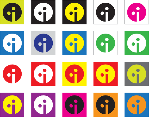
- Brand-first palettes: Businesses are choosing custom color matches (Pantone/HEX) to ensure consistency across all signage and digital media.
Practical Tips for Testing Your Colors
- Print and view from a distance: Step back 15-20 feet to simulate real-world readability.
- Check in different lighting: Test in daylight, dusk, and under artificial light.
- View in grayscale: This ensures the sign is legible even for people with color blindness.
- Compare with your competitors: Stand out by using a distinct color scheme in your market.
Final Thoughts
The best sign colors strike a balance between contrast, brand identity, accessibility, and environmental fit. By choosing the right combinations, you’ll not only capture attention but also leave a lasting impression.
Need help deciding the right color palette for your signage? Indigo Signs has decades of experience designing, fabricating, and installing signage that’s both visually striking and effective.
👉 Contact us today to get started.